SCROLL FOR MORE
An educational website whose aim is to hop on the AI trend and teach other people courses on how to work with or create artificial intelligence and machine learning.
They had no specifics in mind; they gave me a logo and told me to work off of that. I decided to go with the blue of their logo and compliment that blue with a color close to it on the spectrum, a purple to be precise. That got added to their logo post design. I had to search long and hard to find fonts that balance the futuristic but minimalistic preference. I decided to go with Krona One for headings and Kufam for the text. They are clean and simple, but still on theme.


The client wanted to work on this project on a per-section basis, so I did just that. We started with the basics and based the rest of the website off of them. I had free reign on this project, with the only exception being the website has to have both a side and top navigation bar. Below you can see the final product. It is important to note that the other breakpoints were up to other designers to design.
Here we have the basics of the site. My first priority was to figure out the double nav bar layout, which he requested. I also added the footer to the list (which was the last thing I designed). Another basic screen covered was the log-in and sign-in page.


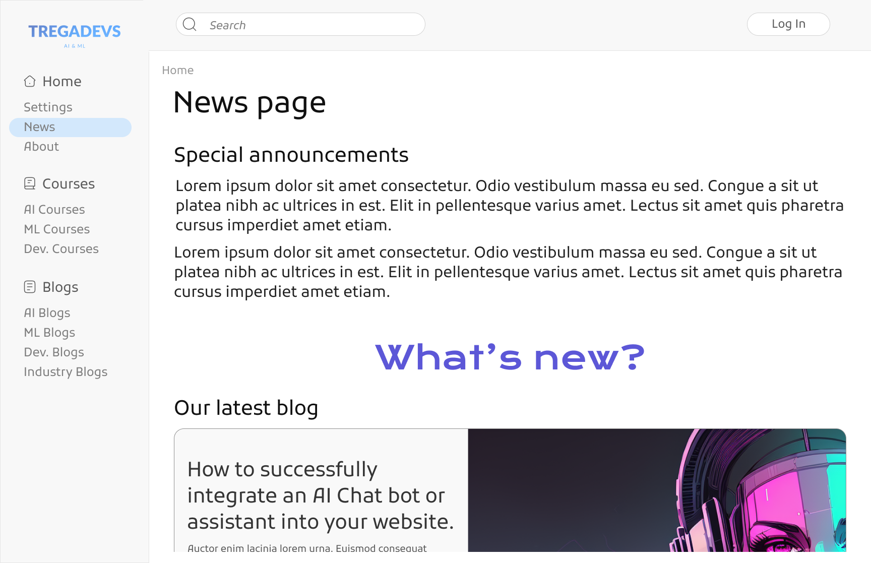
Here you can see the other pages displayed, excluding the course pages. You can view the pages' combined appearance here, along with the complete individual page.


This is the layout for the courses and the course material. The client wanted the UI to have a combination of features from many different educational sites but wanted it to be mainly inspired by Udemy in order to feel familiar.


The design was copied and given a dark mode. Then the rest of the design team made multiple breakpoints to ensure a responsive layout and a flawless transition between different screens. This was then taken to the developers and is currently being developed. Content writers and educators are currently designing the courses.
Clients may not always have a style in mind, examples to work from, or a scheme or brand to work with. It's okay if the only response you receive is a brief statement like "Just make it look good" or "I want a good design" at times. This is the time to be adaptable and receptive. You should be able to succeed without any guidance, no matter how adept you are at following specific instructions.
It's also important to know that not all designs will follow design rules or adhere to them. In some cases, it'll benefit the project more if you think outside the rules and outside the boundaries. As long as it has a good information architecture, adheres to accessibility guidelines, and works best for the user, you are good to go!